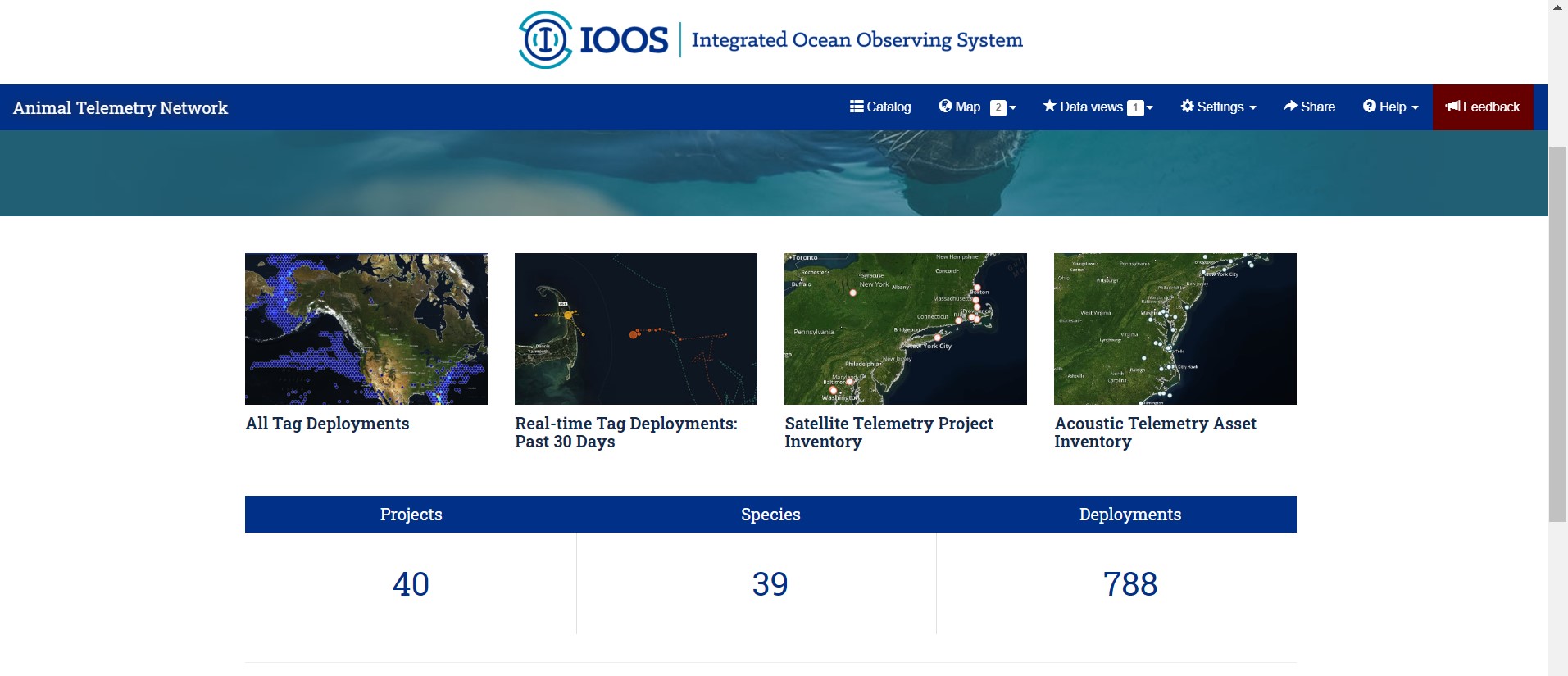
One of our projects at Axiom is the Animal Telemetry Network Data Assembly Center. As a librarian, one of the most exciting pieces of that project, to me, is the data portal. This portal, available at https://portal.atn.ioos.us/, allows for searching, exploring and accessing the multitude of data available through the research efforts of the Animal Telemetry Network. Funded by the Integrated Ocean Observing System and Office of Naval Research, the Animal Telemetry Network is a joint effort to track animal movement and behavior. You can learn more about the U.S. Animal Telemetry Network from NOAA here. The data portal homepage also has some highlighted projects available for getting familiar with the tools available and some of the datasets accessible through the catalog.
The blue navigation bar at the top of the data portal is the easiest way to get started. The catalog and map interface both have search functions, and the most familiar search interface for users is likely the catalog interface. Here there is a search bar for entering a search term, which will then trigger a full text search of the projects, datasets, and platforms available. In our search example, “Sea lions”, 215 results were returned, and the icons to the left of each result title show if that catalog entry is a project (book), or sensor (rectangular tag), and so on. The small menu directly below the search box are filters available for you to sort your results based on these types of entries.
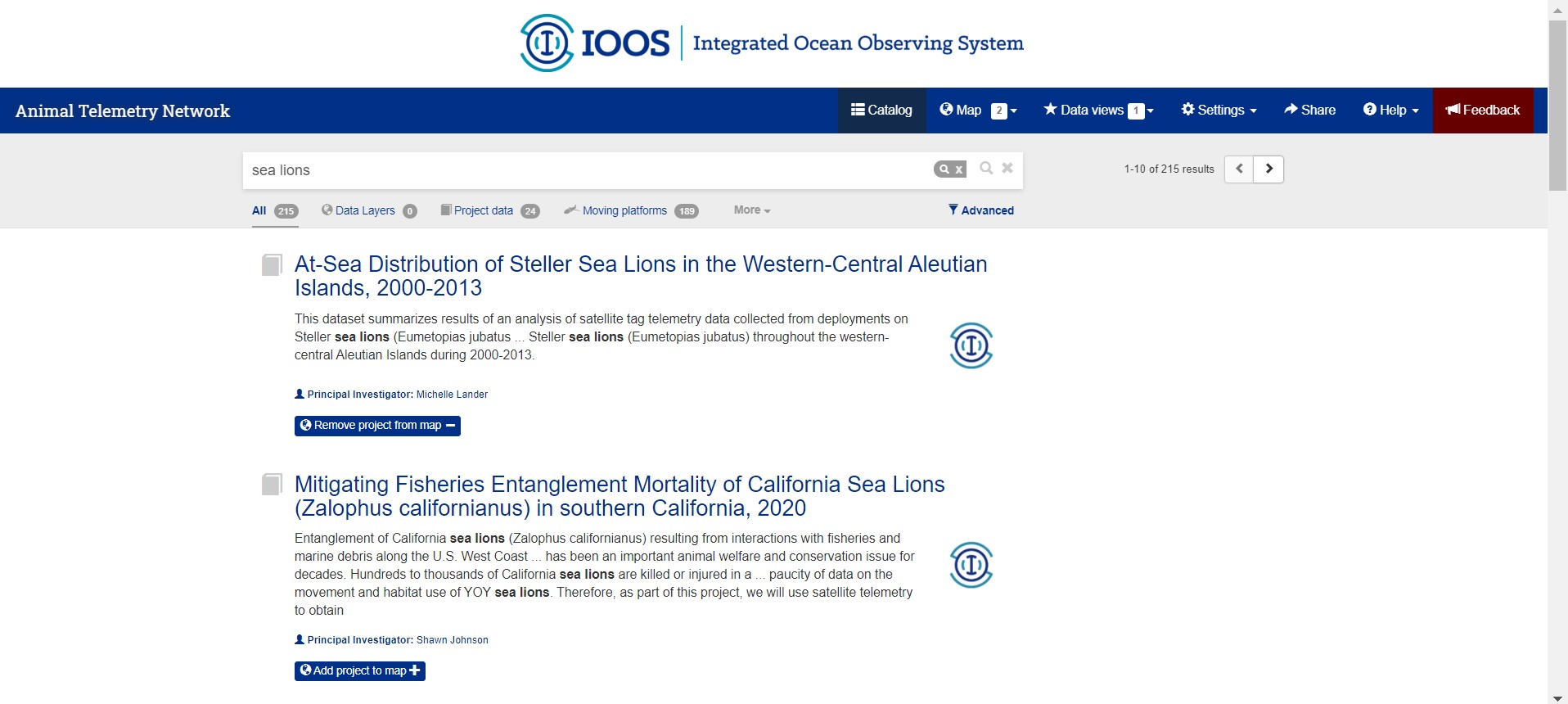
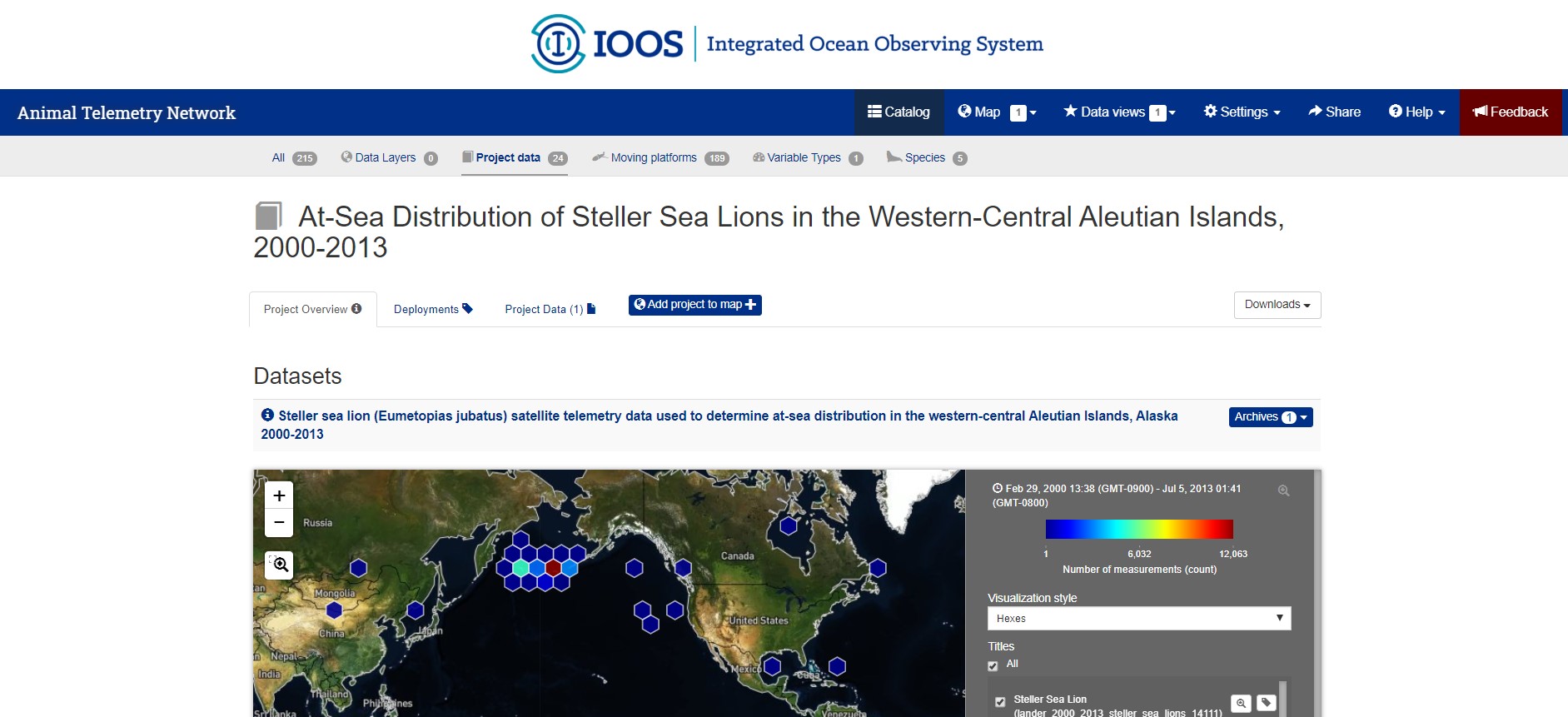
From the search results page, selecting the title of the entry will take the user to the catalog entry page. Here the full metadata details are available, as well as a preview box with a world map giving a high-level ‘quick view’ of the data. These metadata provide the user with more details about the project that gathered the data, such as the title, purpose, the primary investigators and other team members involved, and so on. There are also lists available, in this example, of the deployments, and the data files available for download for users interested in re-using this data. Three cheers for FAIR research!
Once you’ve searched out and landed on a dataset you’d like to explore visually, it’s easy to add that data to your map. Directly below the title on a catalog entry page is a blue button with an earth icon and a plus sign labeled, “Add project to map”. Click and the ‘counter’ icon next to the “Map” button at the top of the page will increase to show you at a glance how many layers you are working with. The “add” button on the catalog entry page will switch to “Remove project from map” if ever you need to do that, instead.
Clicking on the “Map” Button from the blue navigation bar at the top of the portal webpage will bring you to the world view map for visualizing and exploring. The Map shows a split view: it is a zoom-capable map viewer on the left, and a legend bar in a section on the right. The legend bar has a box for each ‘data layer’ you have added from the ATN data catalog. These legend boxes give you options to change the visualization style, select specific data points, and overview information such as the count of measurements in that dataset. There are multiple ways to scale or ‘zoom’ on the map. The first is clicking, scrolling and double clicking directly in the map. The second option is available right from the legend box, where a magnifying glass icon next to the data layer title will ‘zoom to extent’ of the datapoints in that specific layer. This is pictured below. The third option is with the tools available in the top left of the map, a plus sign to zoom in, a negative sign to zoom out, and a tool that will allow you to use your mouse to ‘click and drag’ a focus box to zoom on.
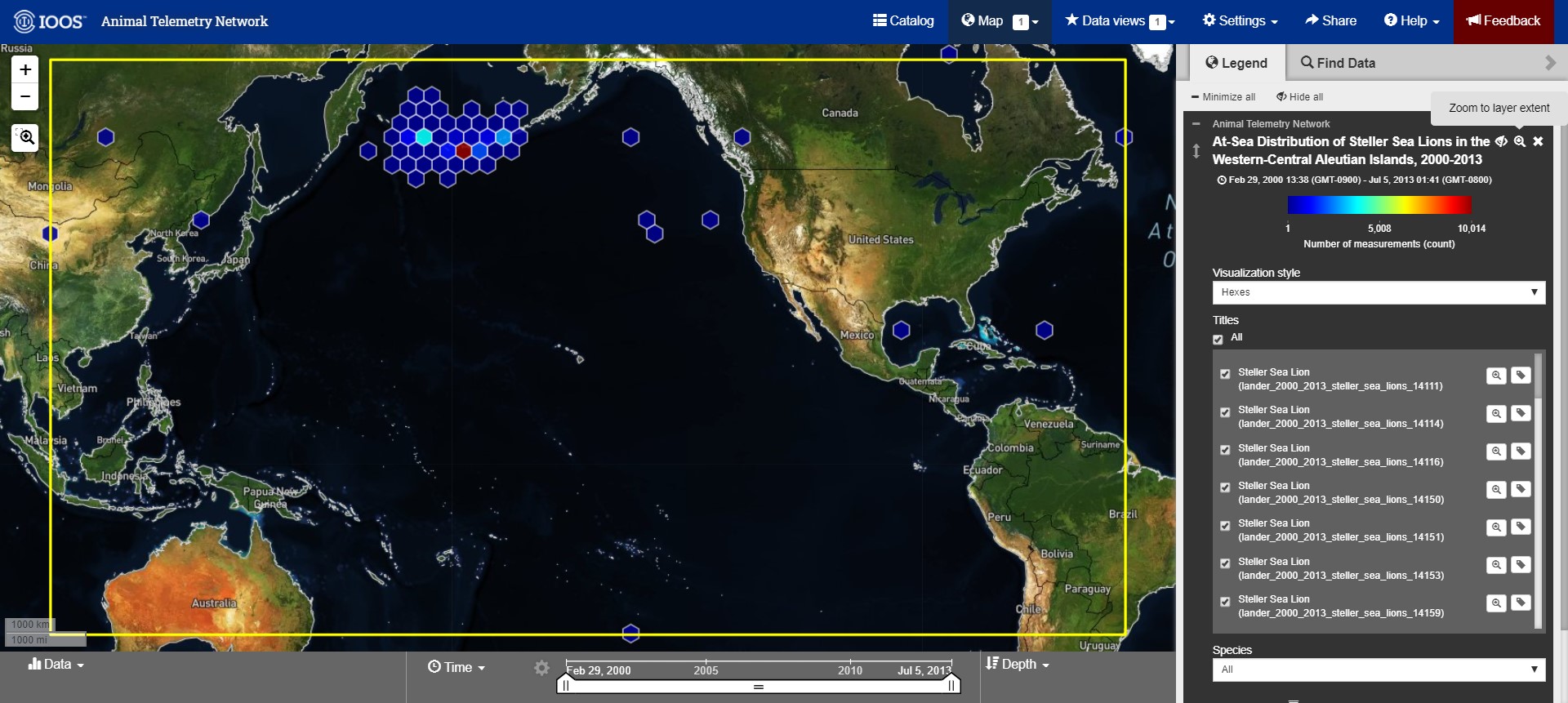
So, folks may be wondering what are these hexagon shapes, the visualization style called ‘hexes’. These hexbins are automatically adjusting to the particulars of your selected data. They give an indication of datapoints at their locations, and the density there. Zooming in and out automatically changes the calculations and the density of this view, which is why more or fewer hexbins appear at different scales of the map.
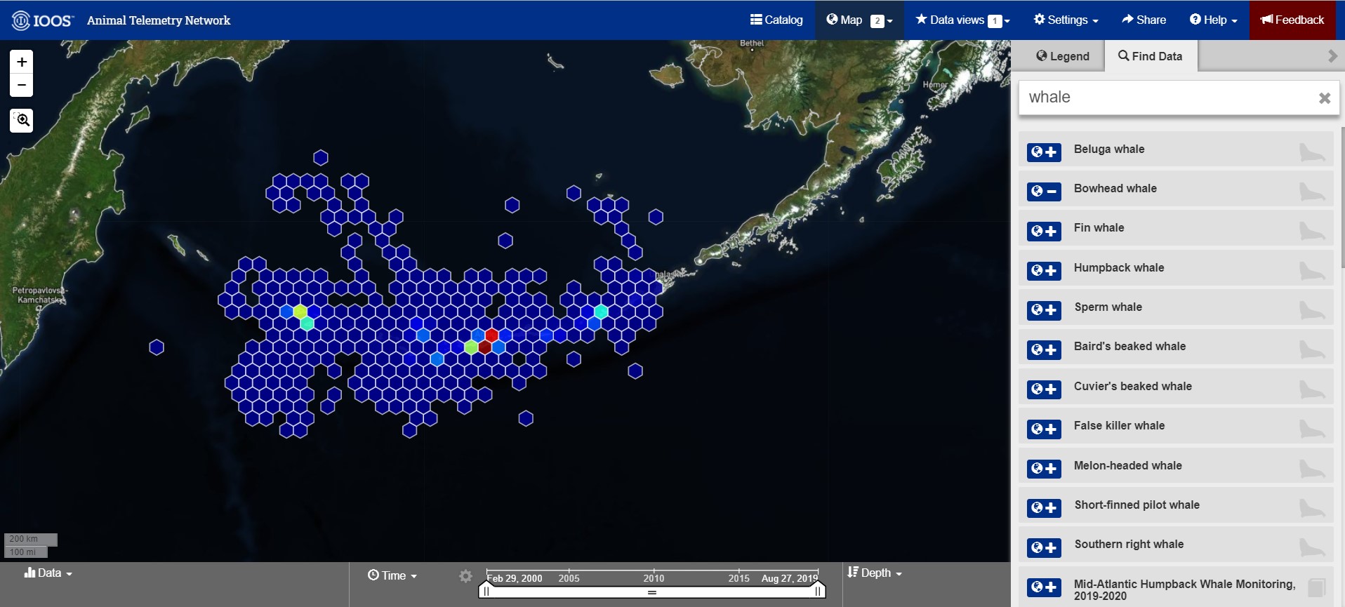
There is an option to add more data layers to the map directly from this interface as well. Next to the legend box title, there is a “Find Data” tab that provides a box for search terms, and lists results from the ATN data catalog by their titles. This is shown in the screenshot below. In this example, I added Bowhead whale data layer by clicking the blue icon ot the left of the result listing. The icon switched from a plus sign to a negative sign to show me that I was successfully, as well as the ‘counter’ next to my Maps button in the top navigation bar increasing.
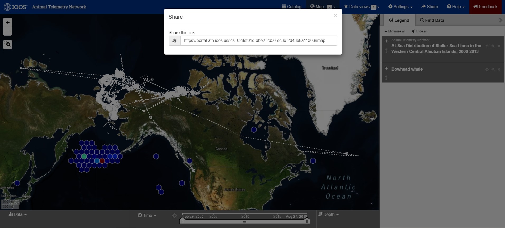
Once the map and the data layers are built to satisfaction, there is an option to ‘Share’ that really cool visual. In the top navigation bar, to the left of the help documentation, is a ‘Share’ button. This button will generate a URL that allows anyone to visit this specific map visualization, and then explore and add data with all the same tools. Share the science!
Researchers can contribute to ATN’s Data Catalog by submitting the data feeds from a tag vendor for your project. Visit this registration portal, for step by step instructions: https://atn.ioos.us/help/submit-data/ . This process will walk the user through the metadata requirements, klike TItle, Abstract, PIs and deployment information for the sensor. Then, you will need to contact your tag venor and authorize ATN DAC account to access the data feeds. The ATN Data coordinator will review your project and contact you with questions.
Thank you for your attention, please feel free to reach out to us with any questions or feedback by the Feedback form or email at info@axiomdatascience.com. If you’ve found this post thanks to EGU 2020, we hope you’re doing well and enjoying the virtual conference!